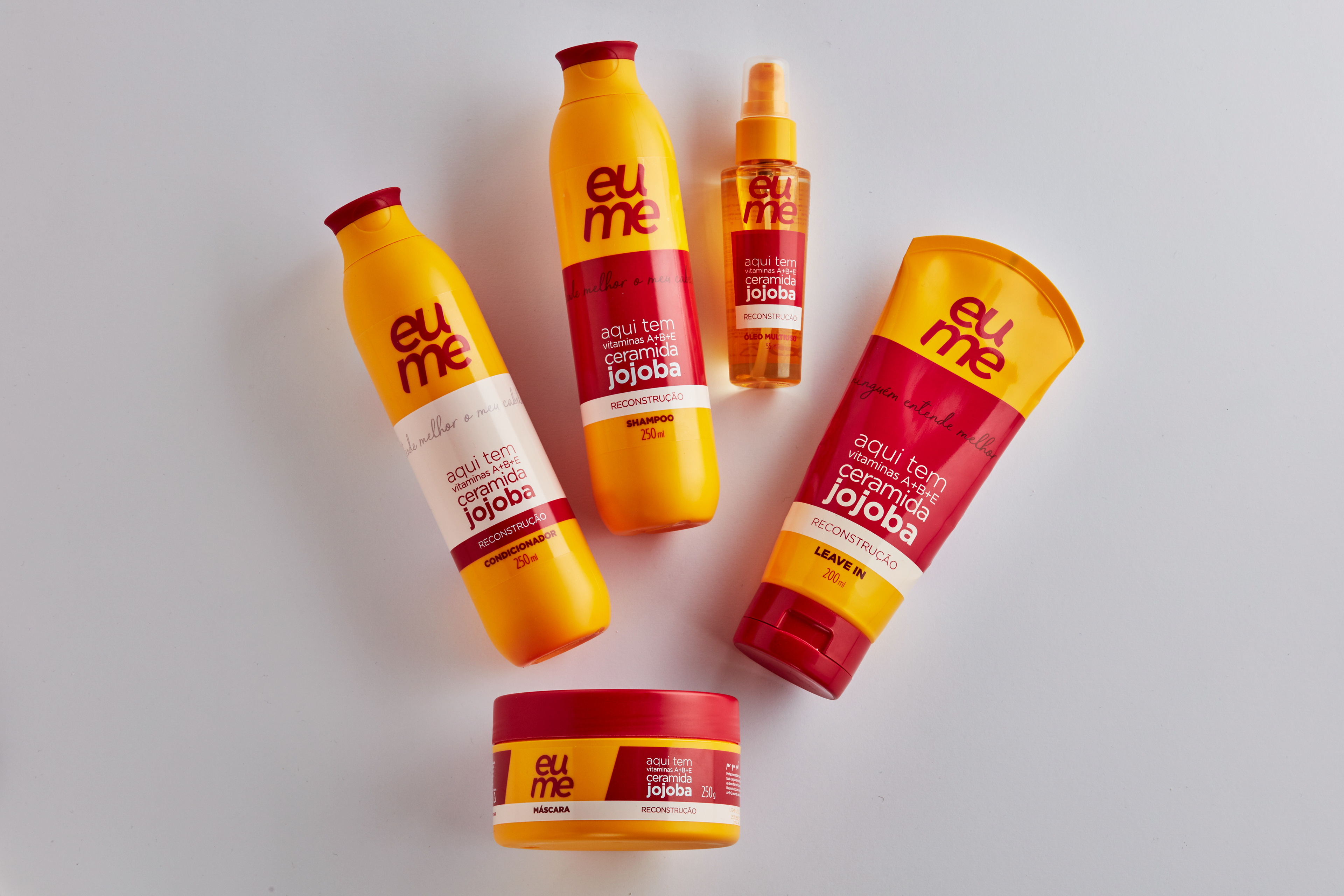
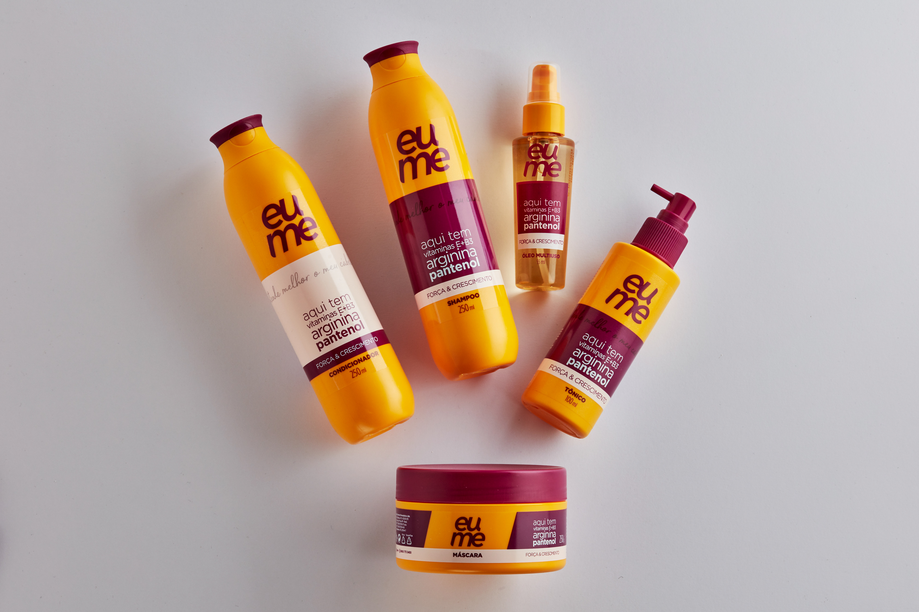
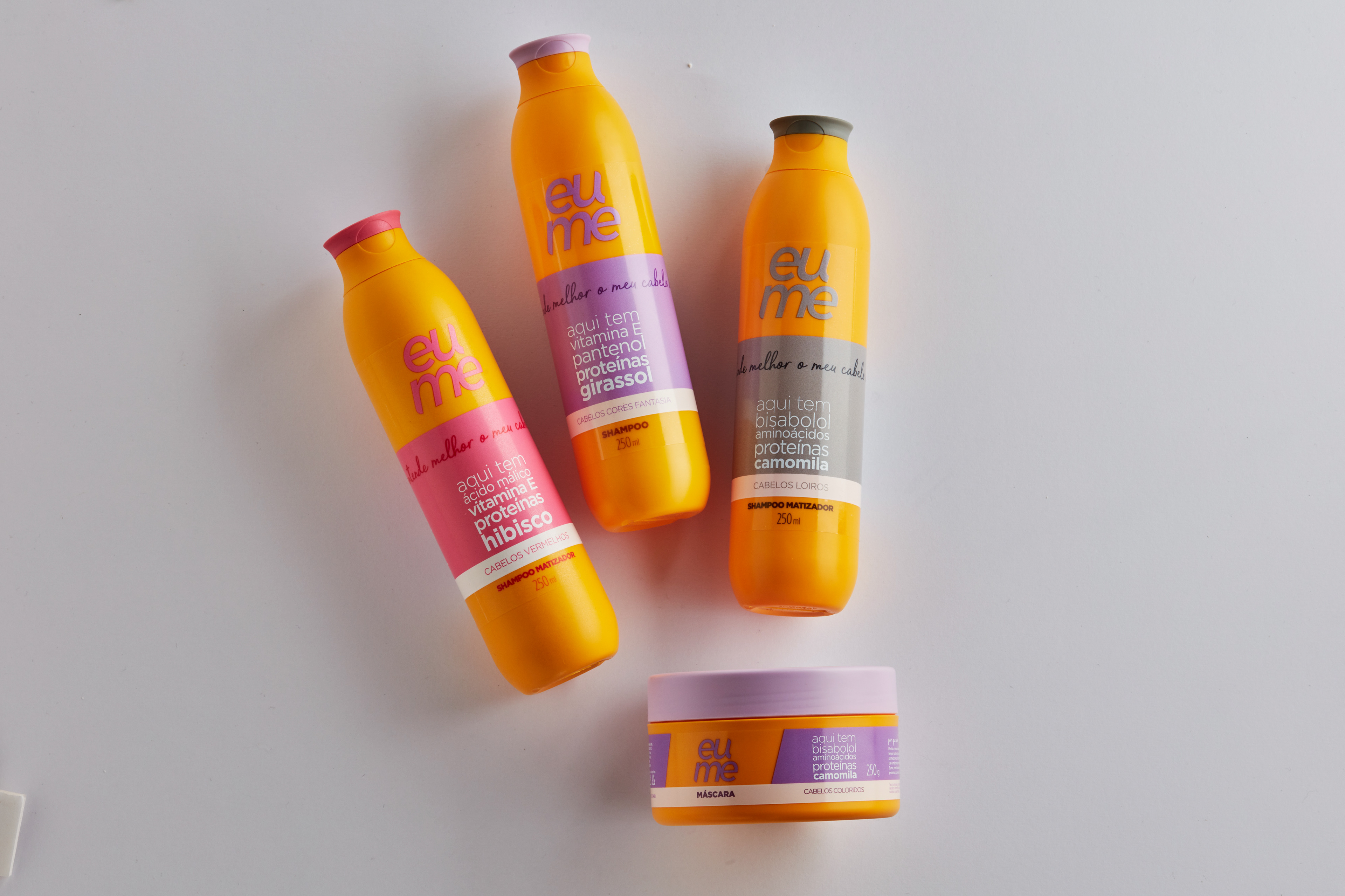
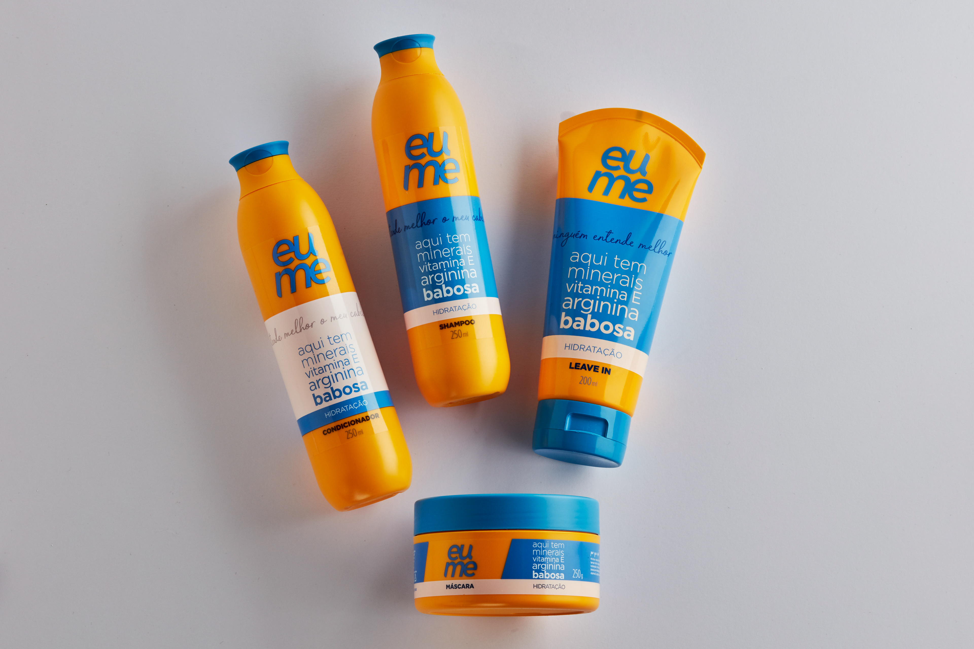
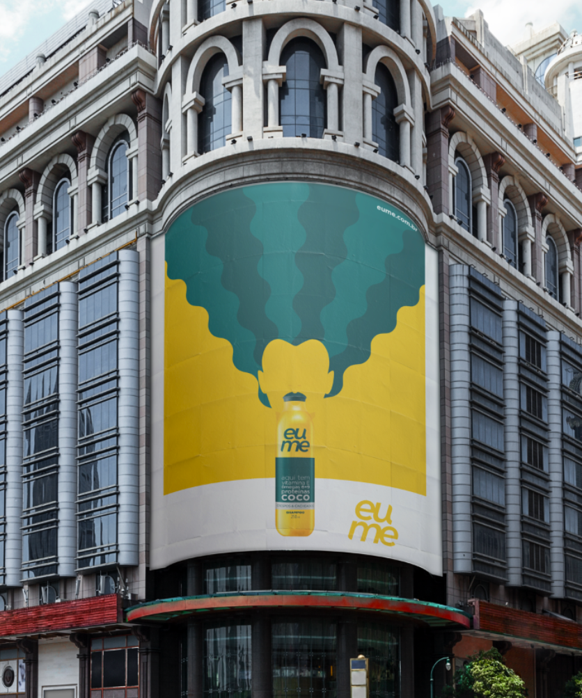
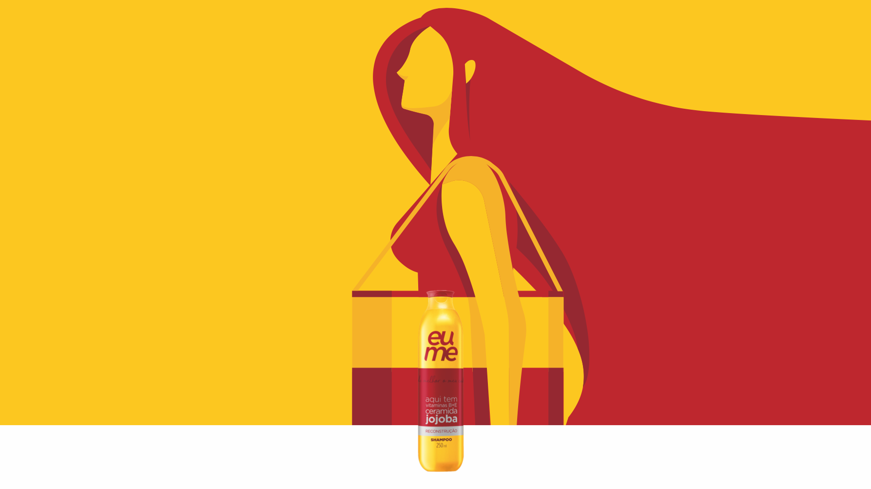
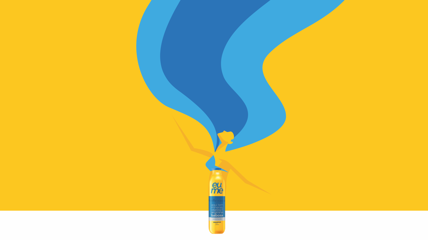
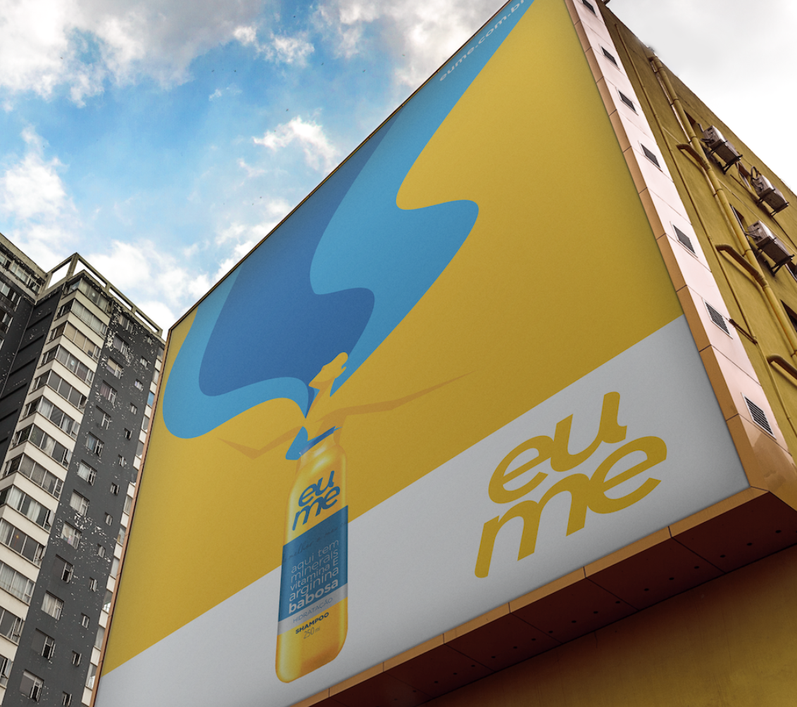
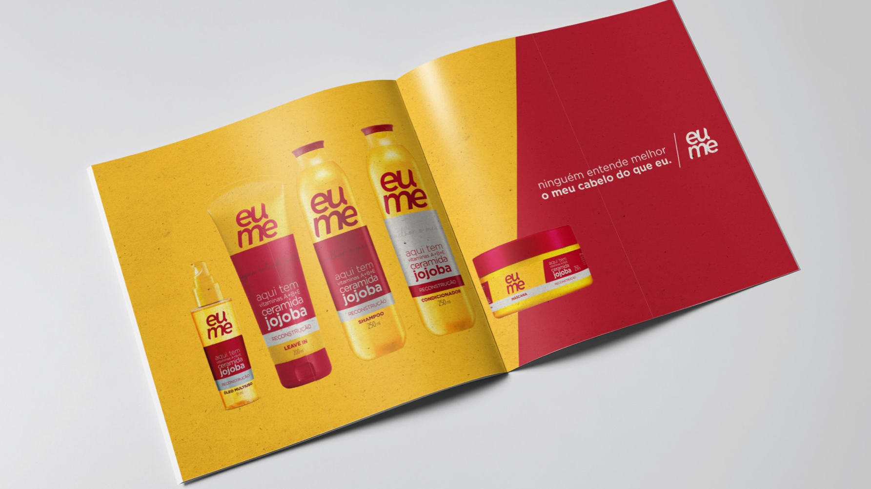
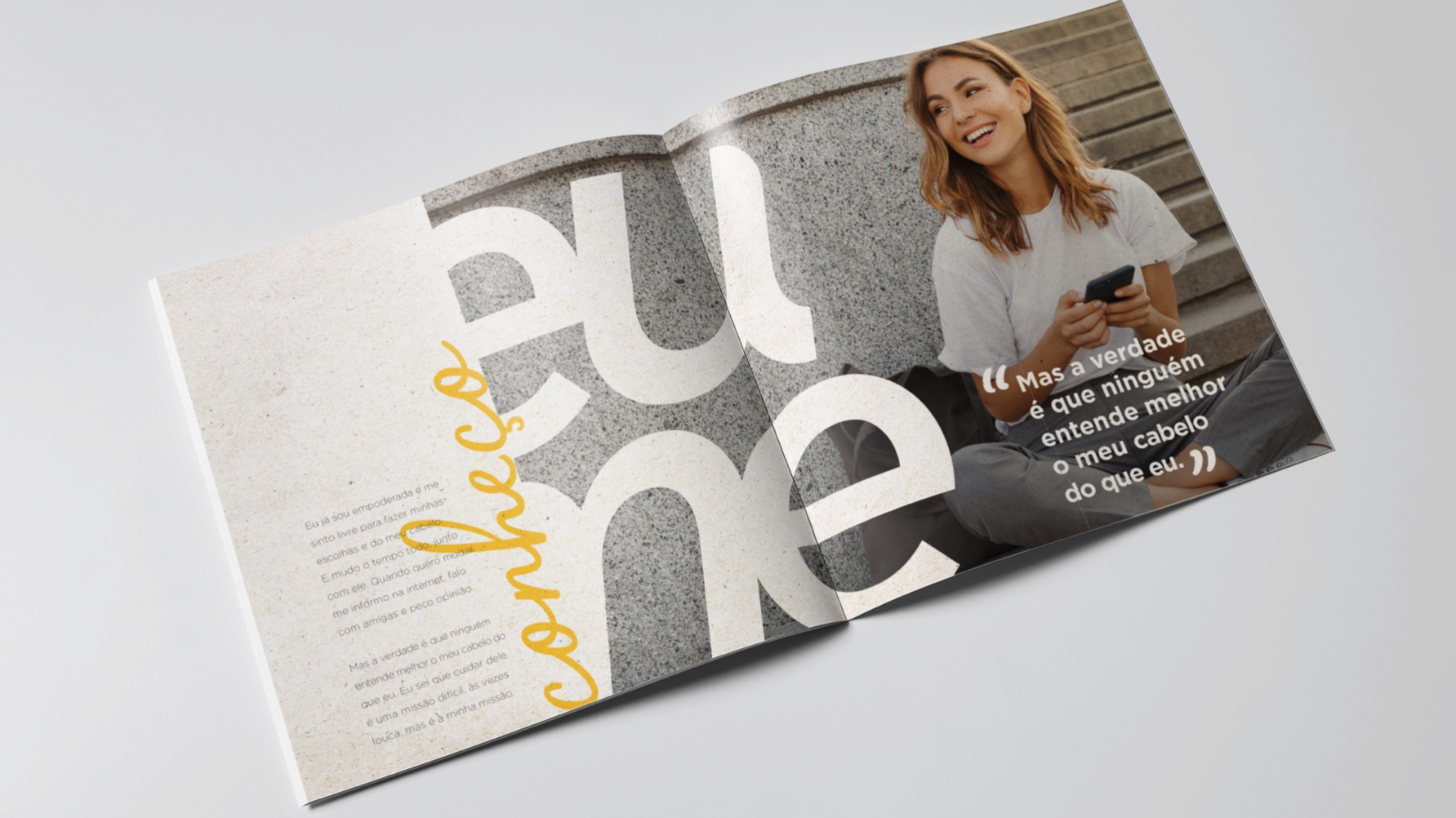
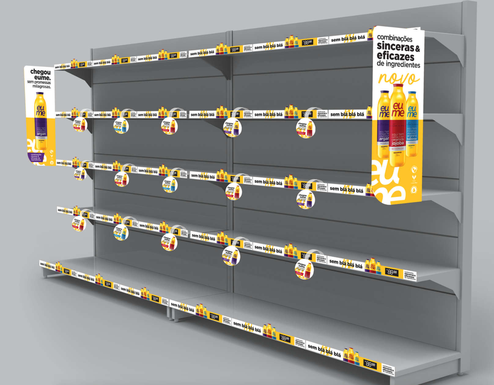
O Boticário needed to develop a brand that reflects individuality - "eu" means "i" and "me" means "for myself", transparency and a true relationship between product and costumer. The logo is like a mirror, reflecting the same image from another perspective.
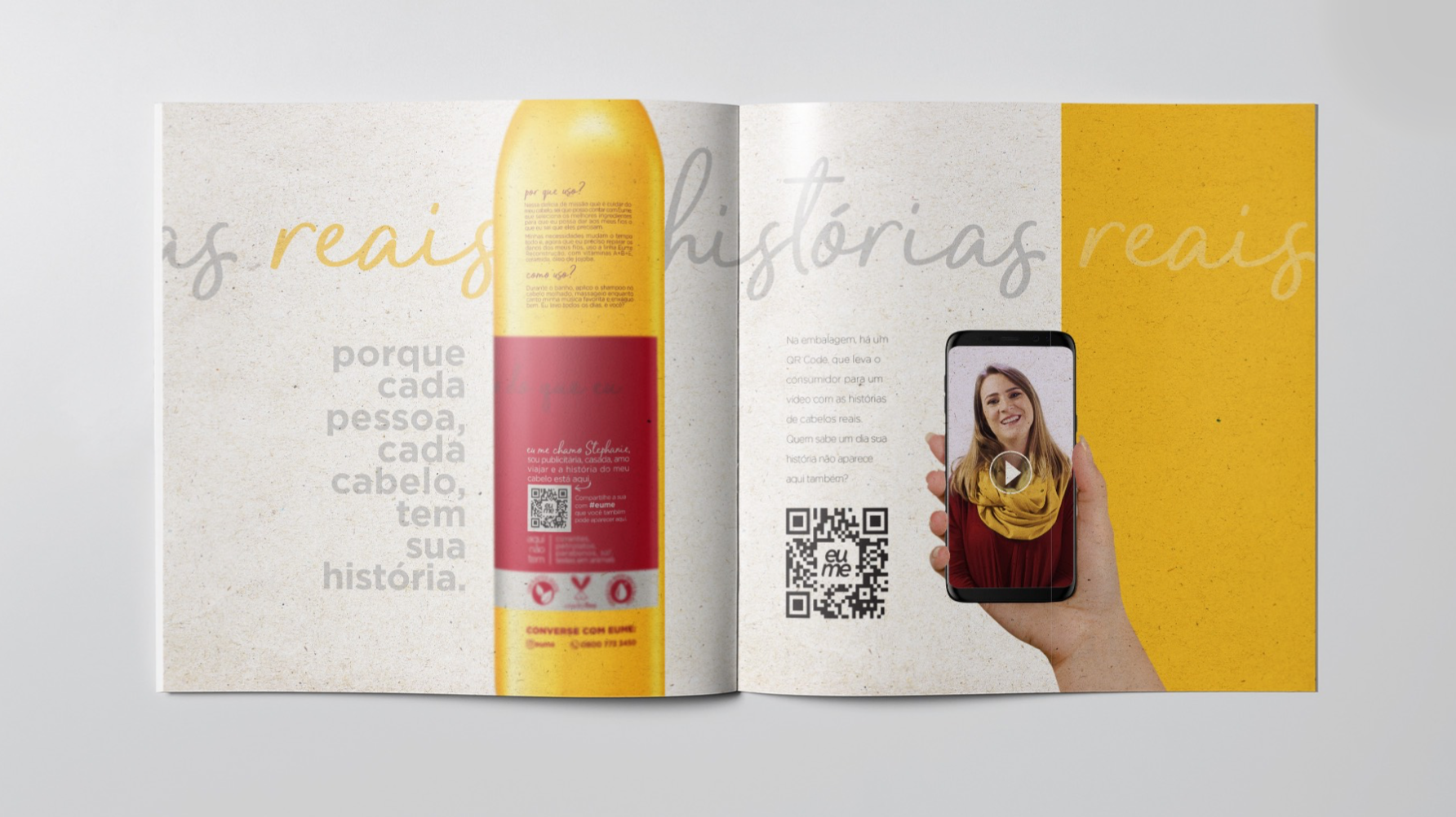
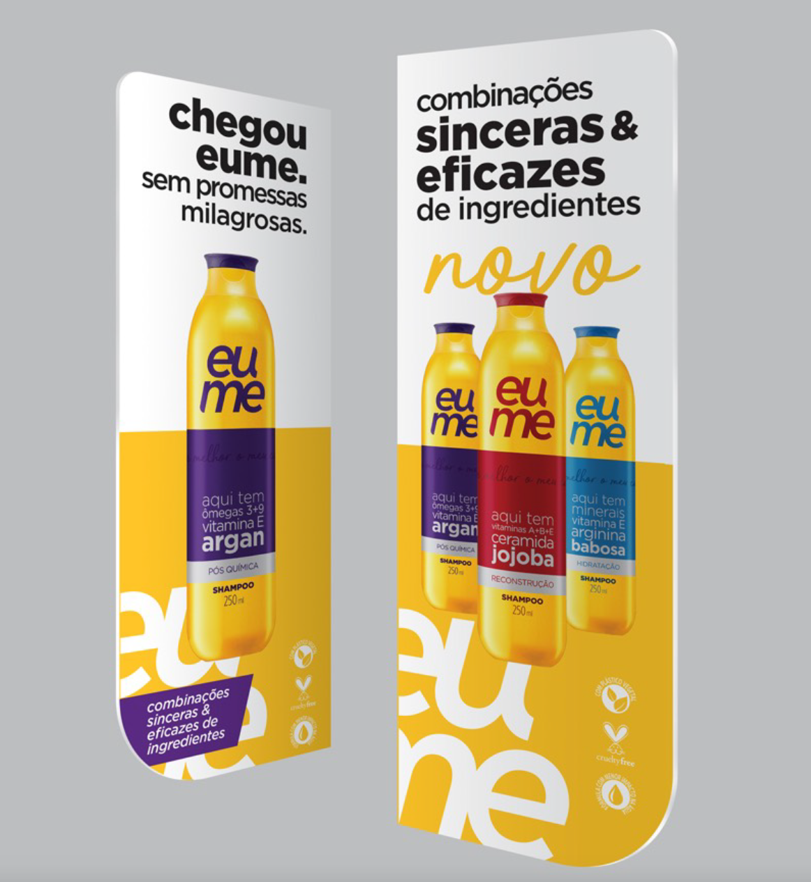
The package brings the ingredients to the front side, reinforcing the simplicity and true information: colors to distinguish, simple shapes to unite and typography to enhance ingredients view.
BRANDING - PACKAGING - ART DIRECTION - ILLUSTRATION - WEBSITE - SOCIAL MEDIA
