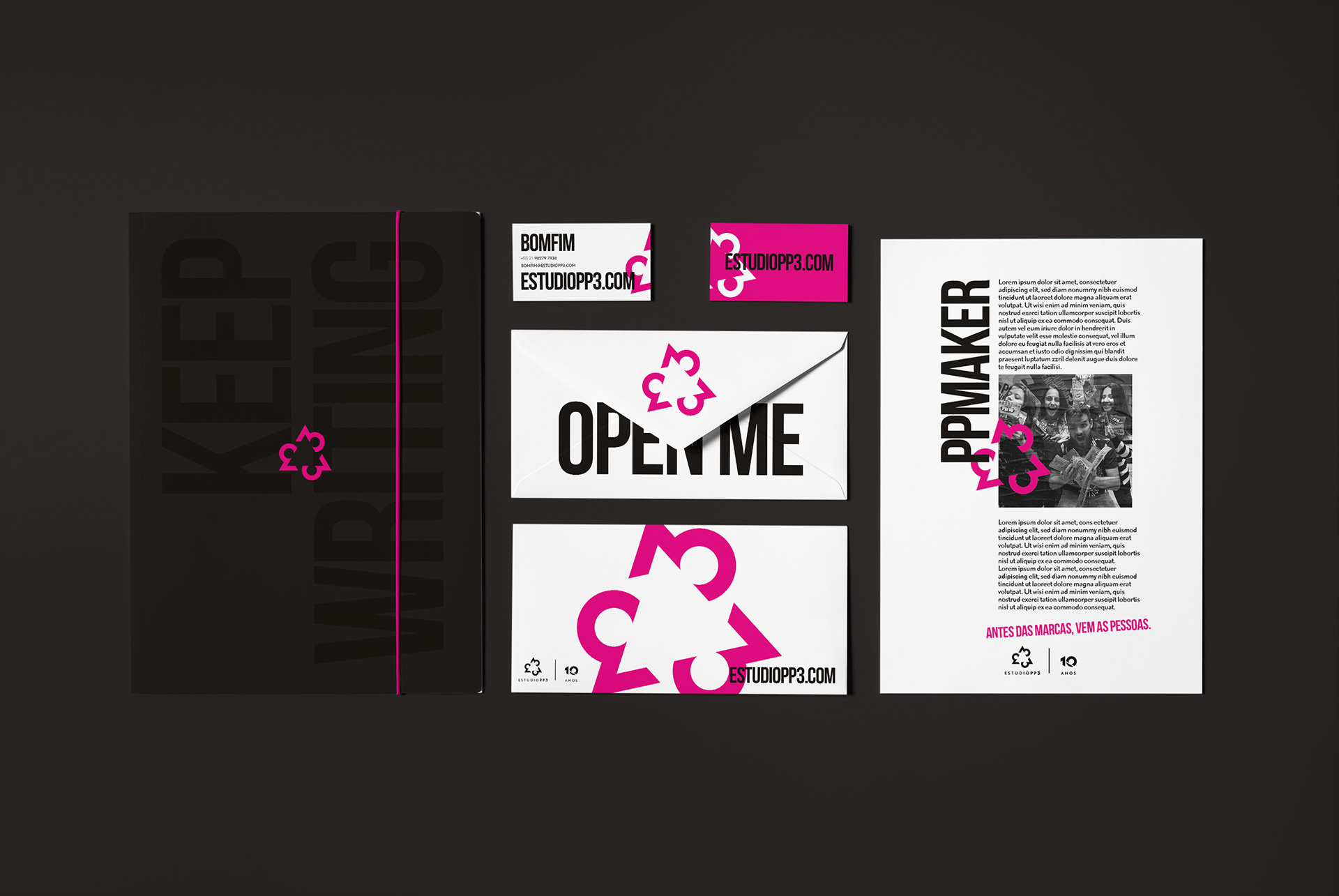
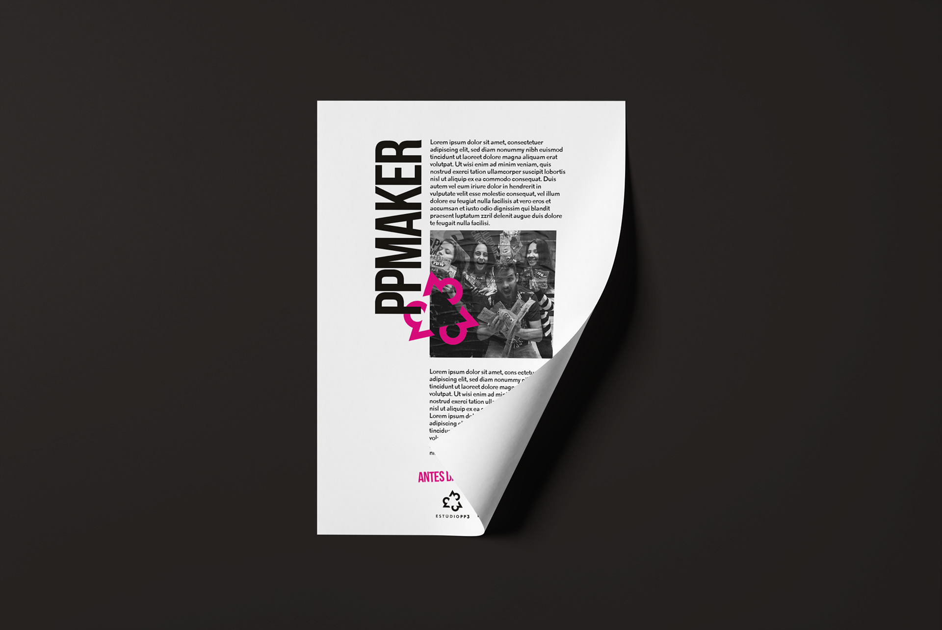
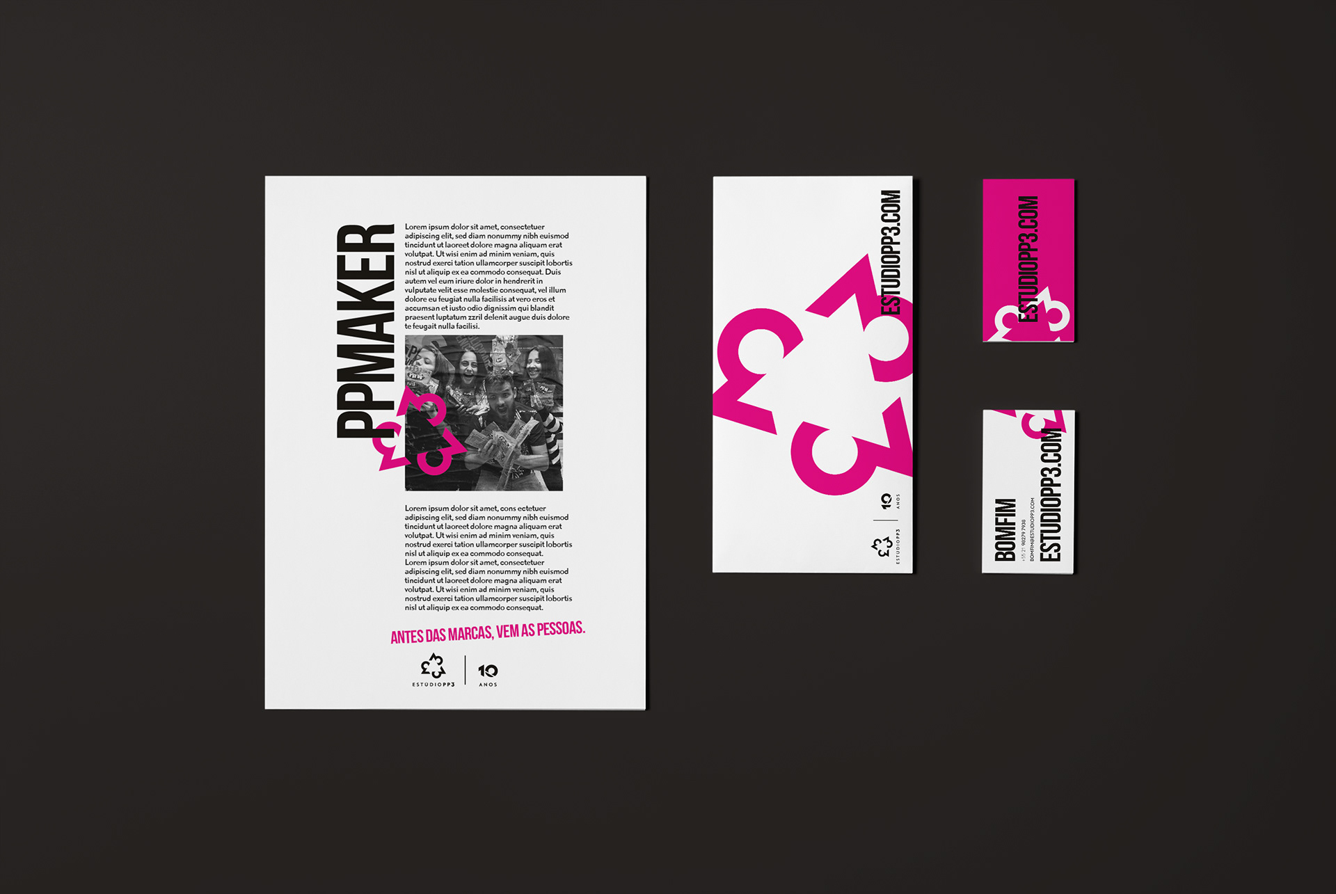
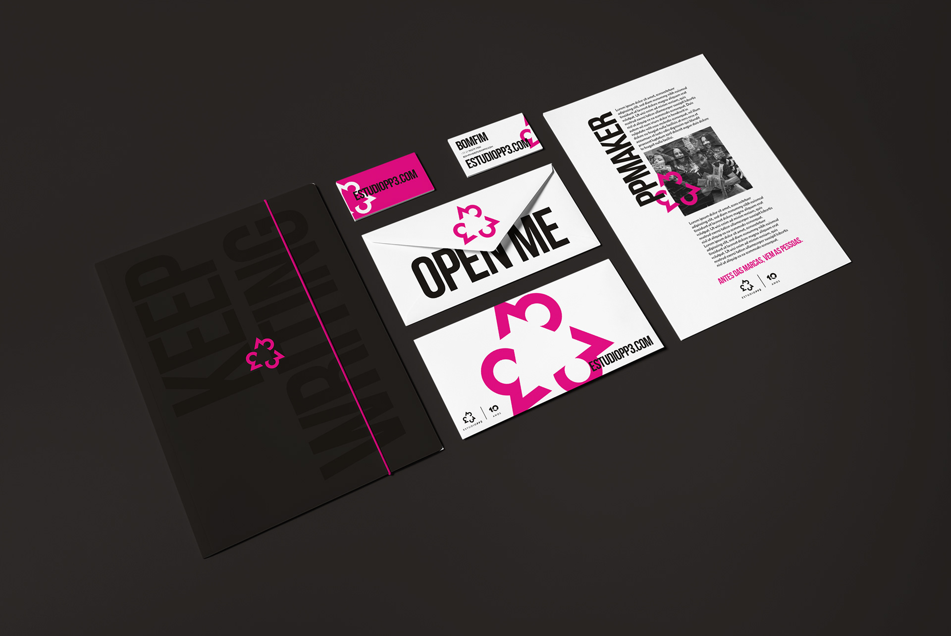
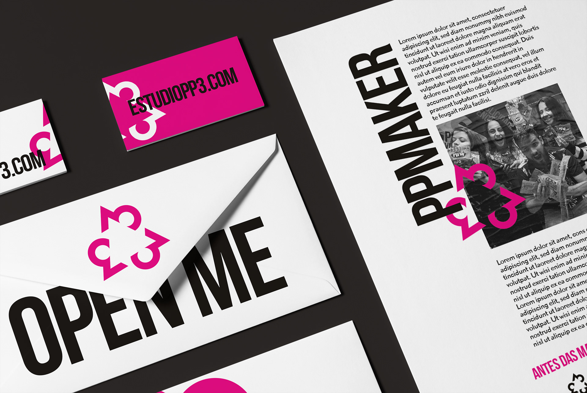
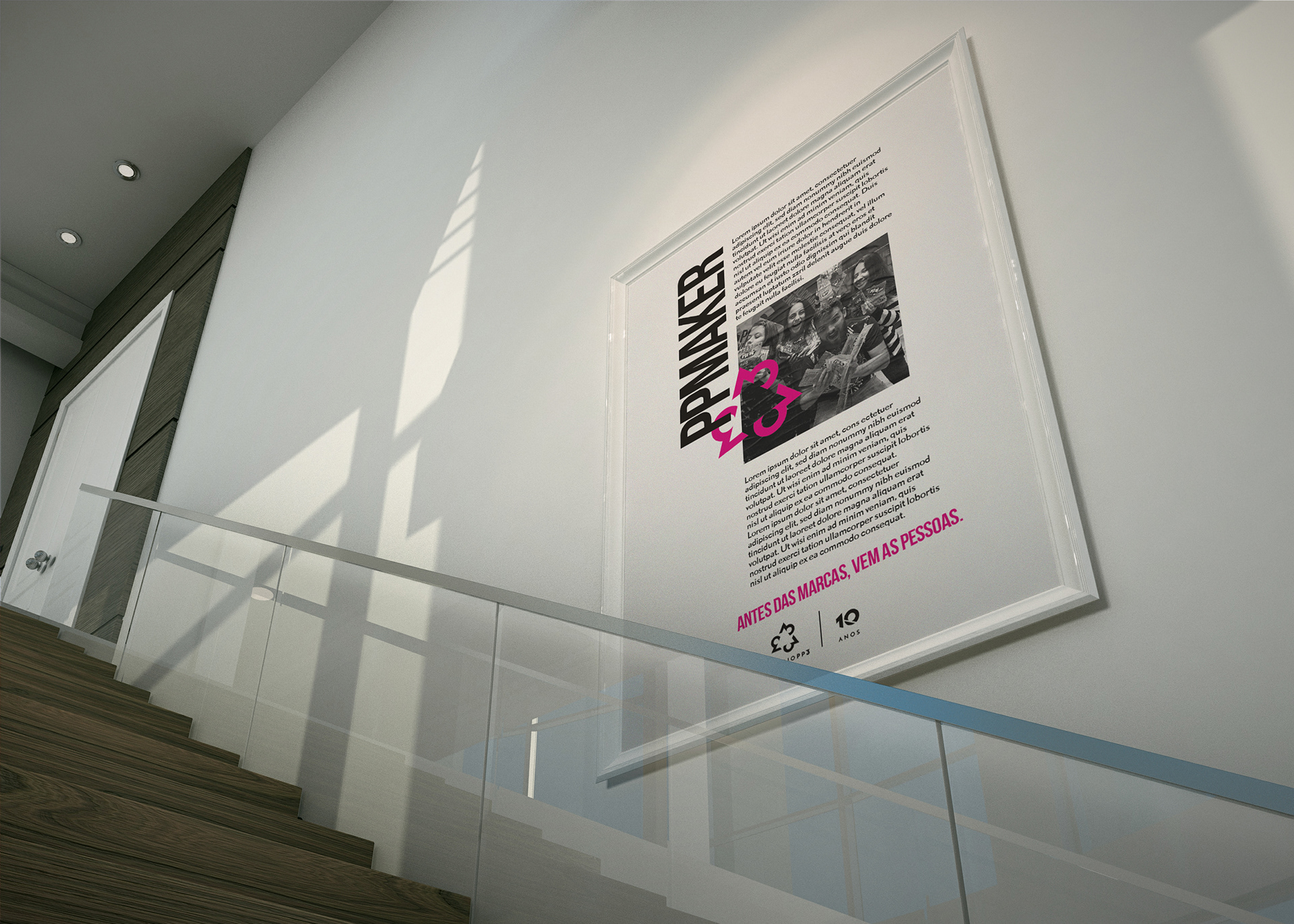
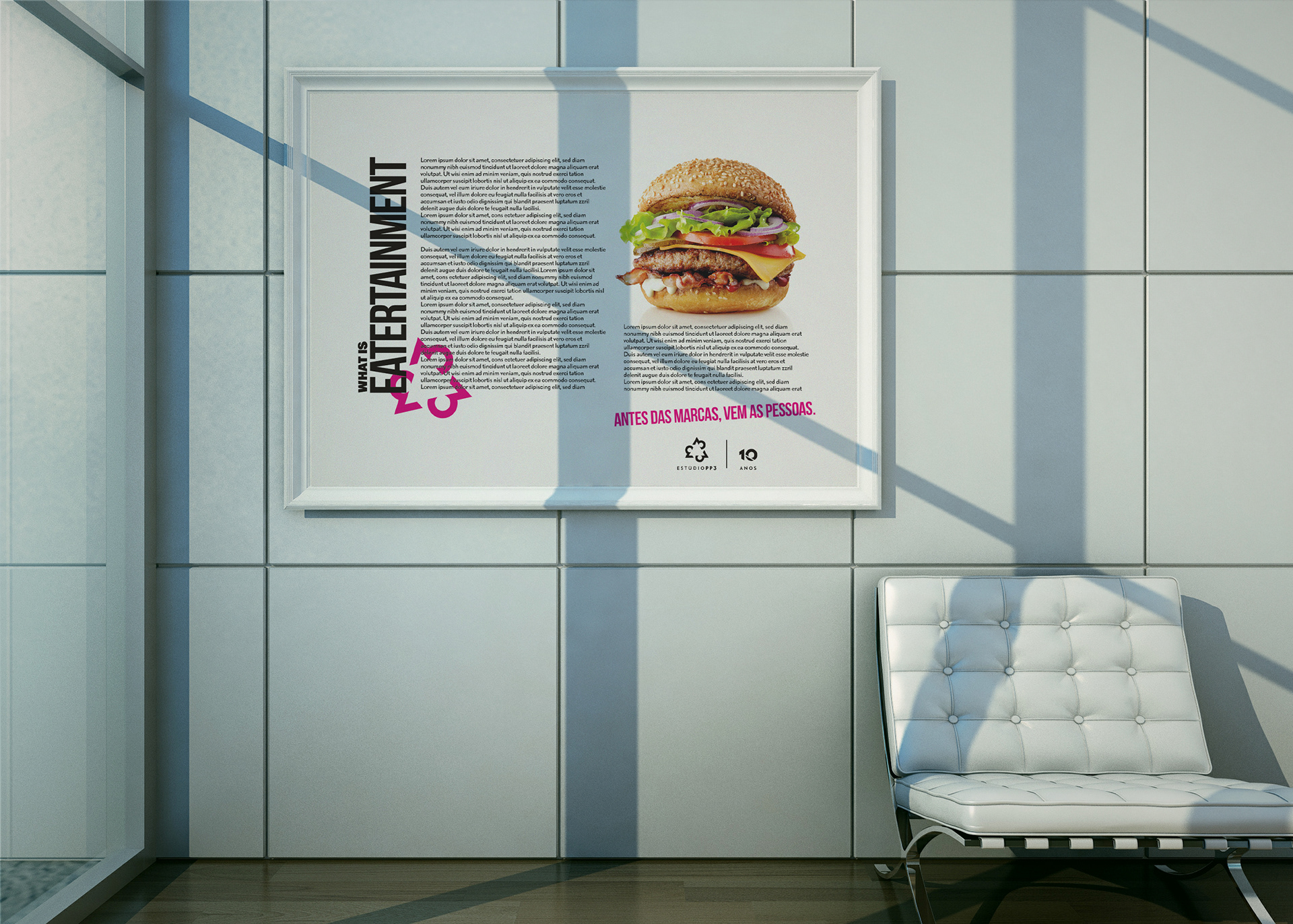
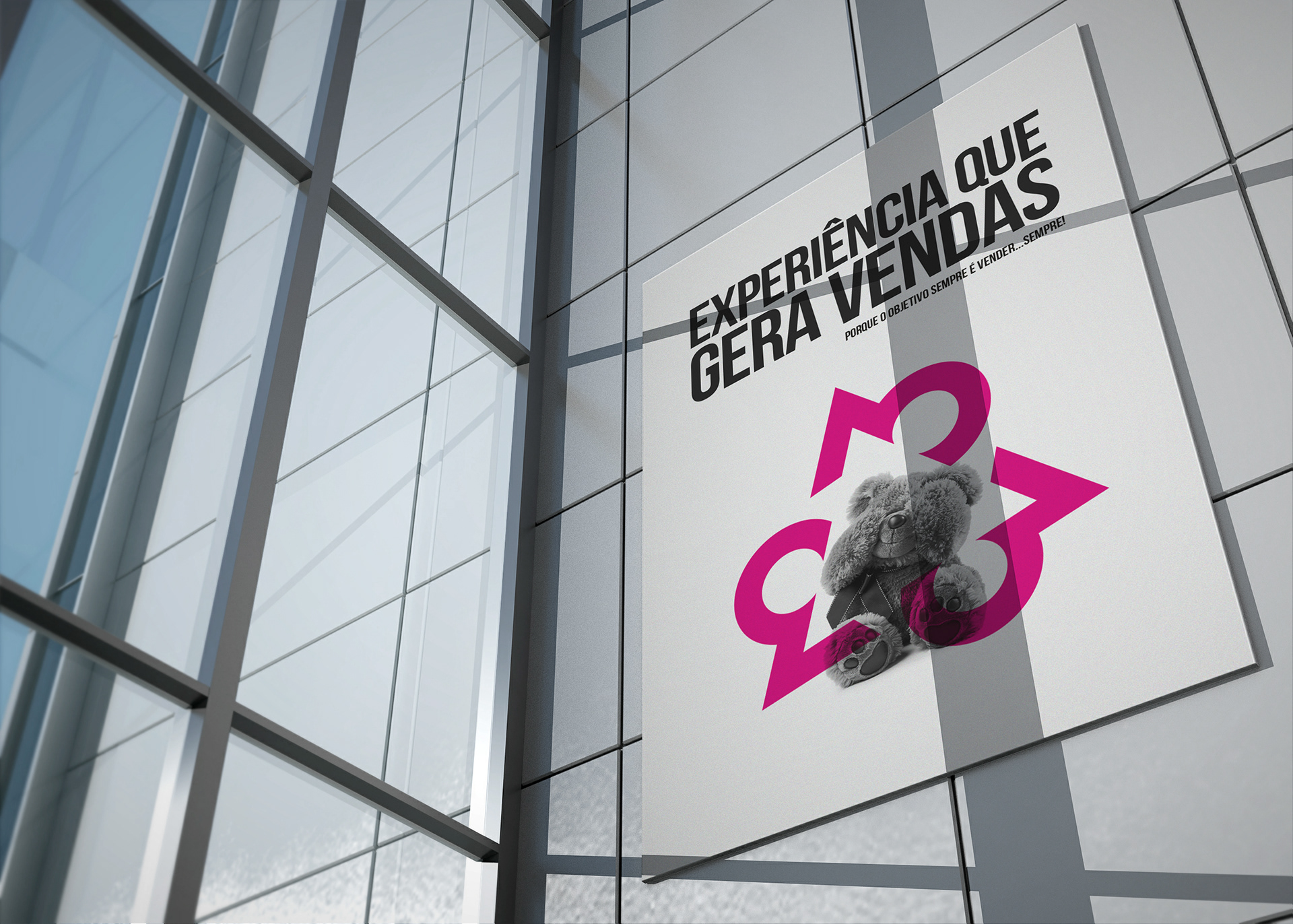
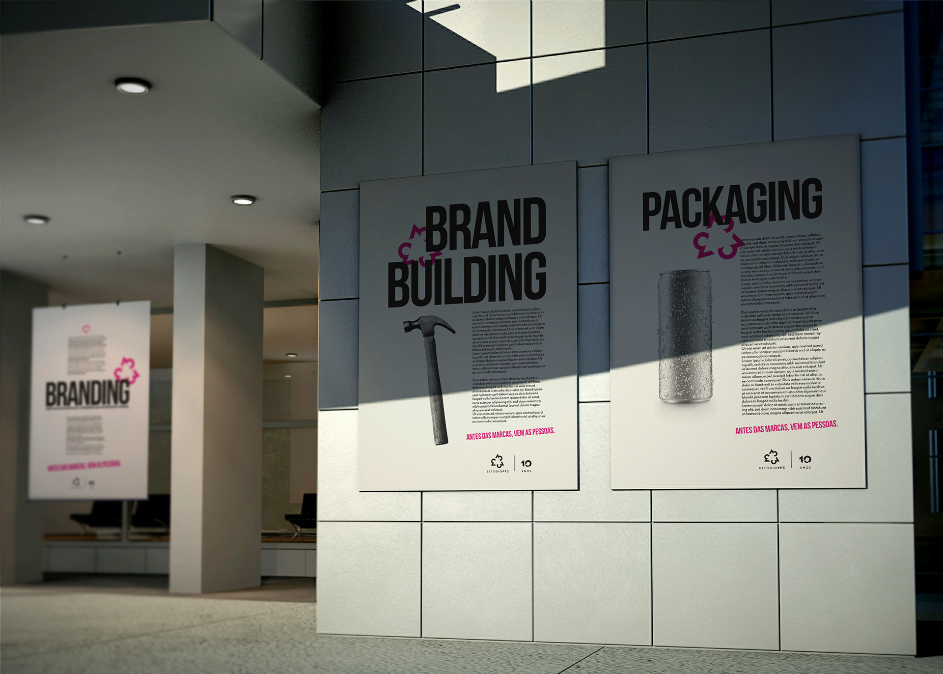
Estúdio PP3 is a multifaceted hotshop, that understand people are on projects, people takes decisions and people working together can achive huge objectives and results. And we have based our relationship with people that works inside the brands: "PEOPLE BEFORE BRANDS!" Focused on 3 pillars of projects development: Branding, Retail and Digital. Based on that, the logo has a balance based on the triangle, which reflects the 3 bases that projects can be based. The triangle and number 3 brings the perception of perfection, and points a direction to grow. The basic colors used in the project have activated 2 sides of brain, Logical and creative sides, having global mobility and without surprises in the bureaus and graphics and the creative message that gives meaning to the grids, images and elements, and the colors meanings: White (simple media works well), Black (strong and bold message) and Magenta (Creativity and joy).
BRANDING - LOGO - PACKAGING - ART DIRECTION - WEBSITE - SOCIAL MEDIA
